Driftwood Coffee
Driftwood Coffee is a conceptual northern Michigan café inspired by the rugged beauty of the Great Lakes shoreline — where weathered wood, soft sand, and quiet mornings create a sense of ease.
For this project, I developed the full visual identity including logo design, color palette, packaging, and merchandising concepts to reflect the brand’s warm, beachy character. The goal was to create a look that feels handcrafted yet clean, inviting locals and travelers alike to slow down, sip, and stay awhile.


Research & Inspiration
I wanted to create a brand that was recognizable and authentic with a versatile identity system that could live across packaging, signage, social media, and merchandise.
So I set out with a plan:
Study Northern Michigan landmarks (shoreline, towns, driftwood, lake textures).
Looked at competitor cafés and regional brands for positioning.
Build a mood board: textures (woodgrain and stone), natural color palette (sandy neutrals and lake blues), iconic northern Michigan images.
Keywords: authentic, grounded, local, modern heritage.
Logo Development
Inspired by the company’s name and the forests of northern Michigan, the logo combines a coffee cup with steam that drifts into the shape of a tree. The design strikes a balance between whimsy and sophistication, creating a mark that feels both inviting and modern.
Submark

Brand elements
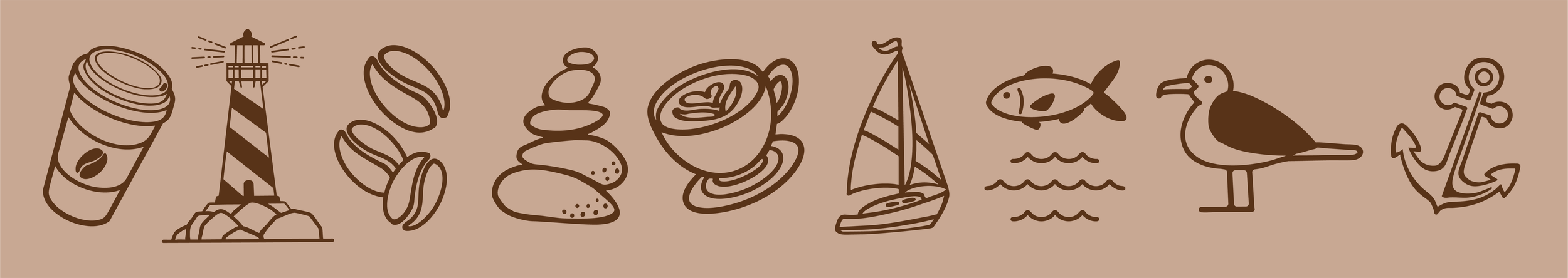
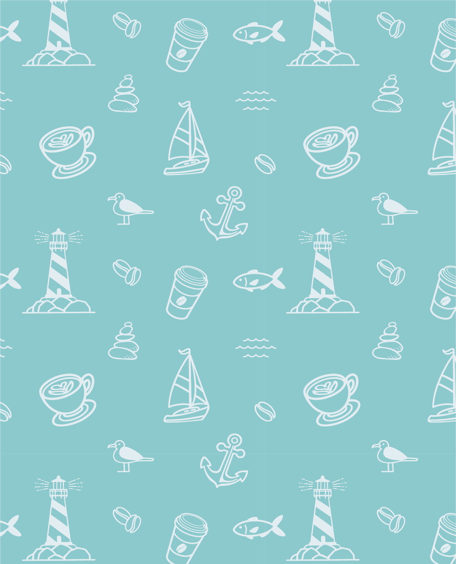
I developed a cohesive set of spot illustrations to enhance Driftwood Coffee’s brand identity. Each icon, featuring northern Michigan motifs, was designed to reflect the brand’s lakeside charm and approachable personality. The illustrations can be applied across packaging, social media, and other branded materials, or combined into repeat patterns to create a unified visual system.